Commercial Spotlight: Cinematographer Kai Saul

“The last few months have been busy again,” says cinematographer Kai Saul, referencing the return of productions following the motion-picture industry’s abrupt shutdown earlier this year in response to COVID-19. “My crew and I are incredibly grateful to be back to work. Everybody understands how important it is to stay safe and healthy so we can keep working. We trust each other to be safe on and off set, and, knock on wood, we’ve all been okay.”
Panavision recently caught up with Saul to discuss the Motorola "Razr" smartphone commercial, which he shot for co-directors Seth Epstein and Dane Del Deo at the start of this year, prior to the pandemic. "It was an exciting and challenging job," Saul enthuses. "There was a clear vision from the start, and I had full creative support from both directors in terms of choosing the camera and the optics, and having their trust to execute their vision. They gave me plenty of space to run with their ideas, which always allows me to do my best work. I also had my A-team camera assistants on this, including 1st AC Nicolas 'Nico' Martin and 2nd AC Alan Certeza, and they were instrumental in keeping things running smoothly."
Panavision: How did you get involved in the Motorola 'Razr' spot?
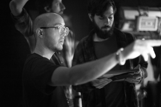
Kai Saul: I came on board via director Seth Epstein, who is also the founder and chief creative officer of the production company Los York. He’s a good friend, and we’ve worked together many times. We have similar tastes and sensibilities and spend as much time on our prep as possible, which streamlines our creative process and allows us to move quickly on set. On a commercial, there’s no time to second guess or realize that you misinterpreted what the director wanted, but with Seth, I’m always confident that we’re on the same page.
When he called me for the project, he showed me the CG elements that he was working on, and he outlined his vision for integrating live action, and that's what I dove into. Seth also brought on Los York director Dane Del Deo to codirect, since this was a multiple-unit shoot. We had a main unit with four or five sets, a tabletop unit, and a stills unit - a lot going on for a one-day job, so it was incredibly helpful to have directors in two places.
With multiple units working simultaneously, how did everybody maintain a unified vision?
Saul: The most unglamorous but crucial part of a DP's job is managerial, and this project was no exception. I didn’t have a 2nd-unit DP, but I did have additional operators, and I would leapfrog through our setups, running from one set to the next to check lighting or sign off on a new frame. We were on a soundstage in L.A., and while we were roughing in a setup on the main set, I’d go and light the tabletop work so that the operator could shoot the next board without me, with some guidance from the client and agency — and as soon as that was in progress, I’d move back to the main-unit setup for final tweaks.
How much time did you have for prep?
Saul: I had about 10 days, which was great. Seth was referencing a lot of high-fashion work, and he wanted a polished, contemporary feel with an editorial-like gloss in the lighting that would complement the sleekness of the phone. He prepared a mood reel for me; one shot would have the right color palette, another would have an interesting camera move, another would have a lighting reference. That in conjunction with his treatment gave me a solid foundation to work with.
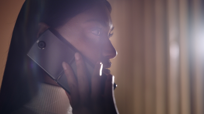
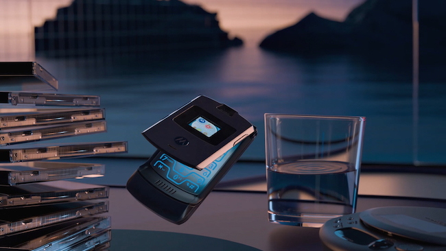
The other jumping-off point was the CG phone elements, which were being created during prep and established a baseline lighting approach for the live-action scenes. We wanted the live action and the CG work to have continuity and not take the viewer out of the commercial when it cut from one to the other. So my process was to dissect the CG and work backwards to decide how to shoot the talent and the phone so everything felt like it was part of the same world. A lot of that was done by pulling the color palette right off the CG renderings and matching it as closely as possible with our LED sources. We had our sunset peach-apricot hue and our dusty blue-purples; those were the two main components of the color palette.
Were all of the CG elements completed by the time you shot?
Saul: They were essentially finished, which was very helpful. Seth was able to put together an edit so we knew exactly where our shots would need to drop in and for how long. From seeing the CG phone spinning through the air, I knew, ‘Okay, I want to do a roll in camera,’ and I could look at the edit and know the speed I should match — and by doing the roll in camera, we could make use of the entire sensor and capture real motion blur instead of doing it in post. Being able to know where the shot would fit in the edit was also helpful for composition and lighting continuity.
What led you to choose the Millennium DXL2 camera?
Saul: One of the initial mandates from Seth and the agency was that they wanted extra resolution for punching in or reframing for different deliverables. Seth had shot a lot on RED and I was very familiar with the Monstro, but I prefer the color science and the look of the DXL2. It’s great in low light and has a beautiful built-in LUT; the look delivered straight out of the camera is very natural and pleasing. So I pitched the DXL2, and he liked the idea. We shot 8K RAW, which gave Seth all the flexibility he needed for post.
While pitching the idea of the DXL2, I was also thinking ahead to the optics. The client was expecting a crisp, high-contrast look that felt slick and modern. I’d used the Primo 70s a number of times on commercials before this — including with the DXL2 on a Samsung spot [‘Galaxy S10,’ directed by Samy Mosher] — and in my experience they fit that bill perfectly. I was aiming for no distortion, no chromatic aberration, and even field illumination, but with that gentle focus roll-off that Primos are known for, and I felt large format was something we could lean into. A lot of our sets were just flats, so I didn’t want to see every pore on every surface in the background or any telltale seams. Being able to shoot on large format gave me the ability to pull the subject to the foreground with more ease, especially on shorter focal lengths, keeping the focus on them and allowing any imperfections in the background to easily fall away.
How did you approach operating and moving the camera?
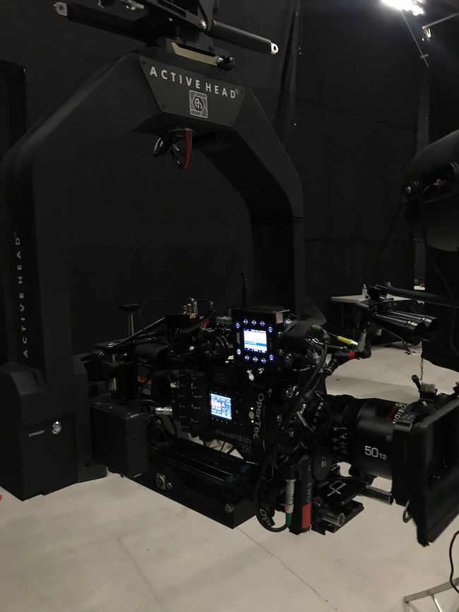
Saul: Almost every shot was done with an Opertec Active stabilized head, with a dampener off of a dolly, and I operated remotely from the wheels. We were moving fast, and Seth wanted to have the ability to move the camera freely to create dolly moves without having to take time to lay track. There’s not a lot of dramatic camera movement in the spot, but we did have some subtle pushes that we wanted to be very smooth, as well as some third-axis rolls, so the Opertec was a great tool for the job.
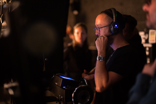
How did the DXL2’s native 1600 ISO impact your lighting?
Saul: 1600 is a really comfortable ISO to work at. I’m able to keep my levels relatively low, and I can get a lot of mileage out of some smaller-powered units, which can save time and money. And because the DXL’s ISO is native 1600, the images are absolutely clean, which was exactly the smooth and polished look the client was going for. Even when I still wanted to be able to bring my levels down and create a little more mood and contrast, I was able to without introducing any noisy, buzzy shadows. They were very happy with that.
Being at 1600 is also nice if I'm on a longer lens and things feel a bit too shallow - there's room to stop down. There's also more room to push the sensor if I need to. On most cameras, I don't want to push much more than 1600, but with DXL, I can comfortably go up a third or half stop of gain and not worry about the images cutting with those at its native ISO.
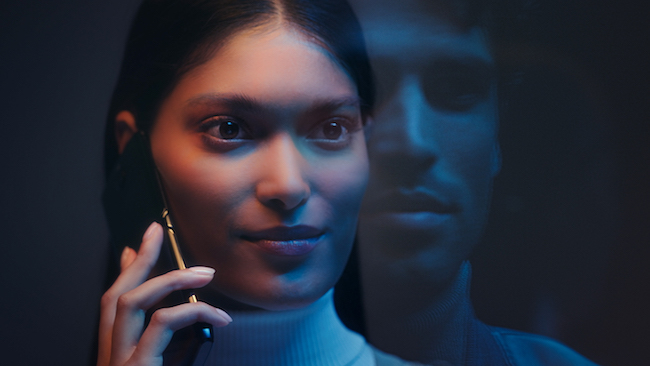
How did you achieve the close-up of the woman near the end of the spot, where you see the man reflected in the glass just in front of her?
Saul: That was toward the end of the day, and it was so rushed! [Laughs.] That was my favorite board, which always seems to be the one I have the least amount of time for. But it was actually pretty simple. We set up a piece of Plexiglas on a C-stand or two and put the woman on the side opposite camera. I started by lighting her since she was the main focus of the shot; we brought in our peachy, apricot-y source from camera left, and a Quasar tube overhead set to our bluish-purple hue added some color contrast and served as an eyelight. Once she was in a good spot, we brought in our male talent next to the camera and placed a black solid behind him to control reflections and make him pop from the background as much as possible. I let the woman’s blue fill/eyelight play on his face as well, and it created this duality between them of warm and cool, light and dark, dusk and dawn — a yin-yang of sorts. We wanted to capture that entire essence of the spot in this one shot since it’s all about the two of them coming together.
The idea is that there are these two people, each in their own environment - the parallel being that the phone itself has two halves, being a modern-day flip phone. That's what kicked off the idea to have these two sides to the color palette, and that was the driving force and inspiration for the whole look. The client and agency also wanted the spot to appeal to somebody who's an early adopter - someone who's willing to try a new technology, who's tech savvy and modern, and who's always on the move. As such, we wanted it to feel ambiguous if our actors are coming or going, or if it's sunrise or sunset. We never spell out exactly what time of day it is, but it's one of those in-between hours - the day might be either starting or ending. It was satisfying to weave that theme all into one shot and bring both our talent together at the end.
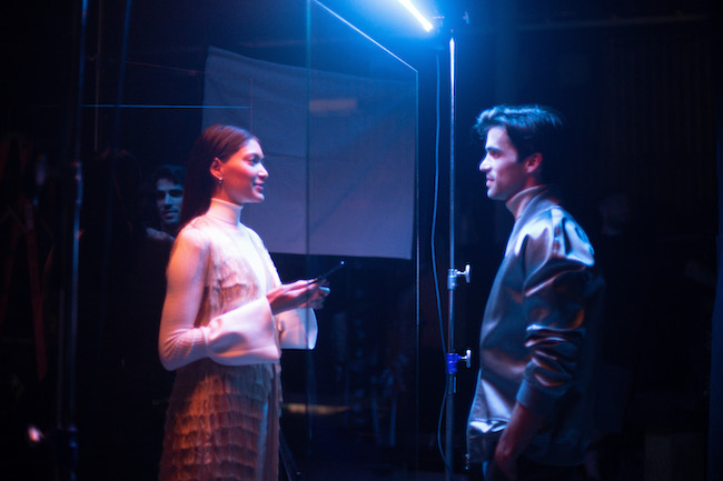
Images courtesy of Kai Saul.